2008 RIBA National & European Award 獲獎者公布

設計競圖、競賽及獎項、公共工程標案、私人招標相關資訊
eaGer
網站管理者
文章: 14159
註冊時間: 2008-05-04, 11:28
聯繫:

文章 eaGer »

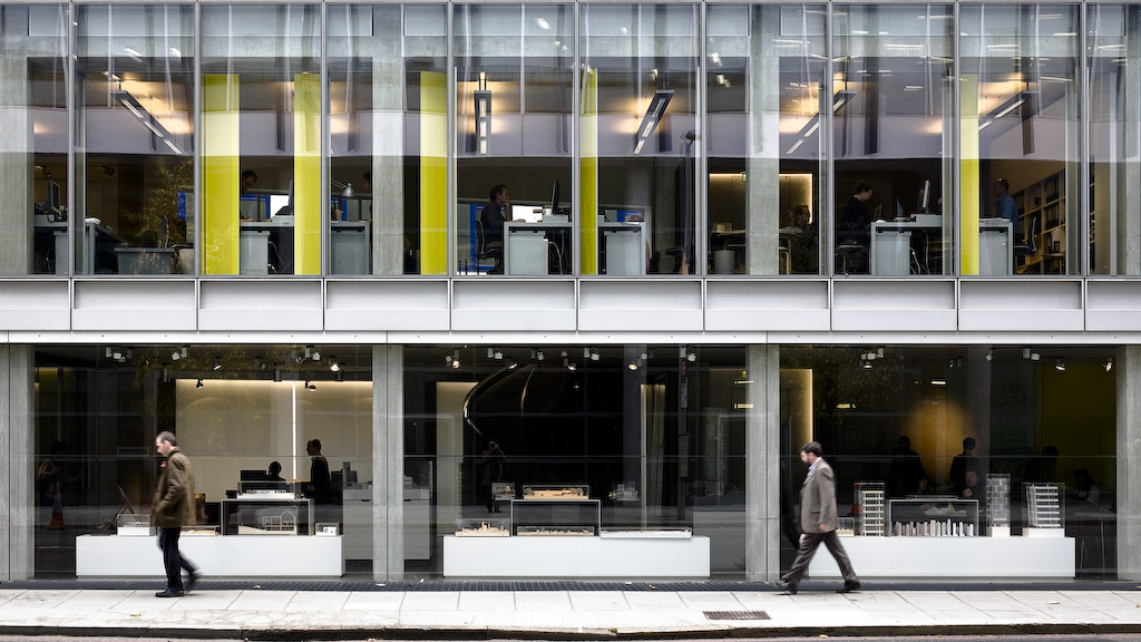
Allies and Morrison 建築師事務所位於倫敦,建築物也是他們自己設計的。

地址:85 Southwark Street, London SE1

從街道上看起來挺不錯,還有模型擺在那邊,真帥!

圖檔
eaGer
網站管理者
文章: 14159
註冊時間: 2008-05-04, 11:28
聯繫:

文章 eaGer »

圖檔

設計案:Wembley National Stadium 溫布利球場, London
建築師:Norman Foster + Partners / HOK Sport
業主:Wembley National Stadium Limited
顧問:Mott Stadium Consortium, Franklin + Andrews, Mott Stadium Consortium , Nathaniel Lichfield and Partners, Ove Arup and Partners, Sinclair Knight Merz (Europe) Limited, Sports Turf Research Institute, Steer Davis Gleeve
影片:0102
描述:
Originally built for the British Empire Exhibition of 1924, and in turn the site of the Olympic Games in 1948 and the football World Cup Final in 1966, the old Wembley Stadium was the most important sports and entertainment venue in Britain. The challenge in reinventing it for a new century was to build on that heritage and yet create a venue that would be memorable and magical in its own right. With 90,000 seats, standing almost four times the height and covering twice the area of the original, the new stadium is the largest covered arena in the world. Facilities are designed to maximise spectator enjoyment; seats are larger than the old ones, with more leg-room; the highest tiers are easily accessed via escalators; and the concourse that wraps around the building provides catering for up to 40,000 spectators at any one time. One of the things that make the stadium special is the retractable roof, which ensures that the spectator experience is comfortable in all weathers. When the roof is open it ensures that the turf gets sufficient sunlight and air to maintain perfect condition, while in poor weather it can be closed to cover the entire seating bowl. The roof is supported structurally by a spectacular 133-metre-high arch that soars over the stadium, providing an iconic replacement for the old building’s twin towers; conceived as a triumphal gateway, floodlit at night it is a strong symbol for the new Wembley and a new London landmark. The stadium is designed to be ideal for football. Its geometry and steeply raked seating tiers ensure that everyone has an unobstructed view. To recreate the intimate atmosphere and the distinctive ‘Wembley roar’ for which the old stadium was famous, the seats are located as close to the pitch as possible. Yet the building has also been consciously ‘future proofed’, with the ability to host a variety of events, including international track and field events to Olympic standard if required.

圖檔

圖檔

圖檔

圖檔

圖檔

圖檔

圖檔

圖檔

圖檔

圖檔

圖檔

圖檔

圖檔

圖檔

圖檔

圖檔
eaGer
網站管理者
文章: 14159
註冊時間: 2008-05-04, 11:28
聯繫:

文章 eaGer »

呼,今天的進度剩下一個:

Terminal 5, Heathrow Airport, by Rogers Stirk Harbour + Partners

這個案子的資料應該不難找,馬可加油囉!不過我知道大陸的網路很慢,而且很多網站甚至被政府封鎖,如果真的找不到就由我來吧!
Marco

文章 Marco »

設計案:The Belgrade Theatre 增建案, Coventry
建築師:Stanton Williams
業主:The Belgrade Theatre
營造廠:ISG Interior Exterior PLC
結構顧問:Flint & Neil Partnership
服務工程師:RYB Konsult
造價:1100萬英鎊
完工:June 2007
總樓地板面積:2192 平方米
描述:

This new theatre addition and refurbishment of the existing post-war modernist Belgrade Theatre boldly transforms and revitalises the theatre into a distinct cultural hub for Coventry.

Internally the new building has great atmosphere by day and is particularly seductive at night. The blacks, greys and red of the internal palette wash outwards over the sculptural forms of the new elements. The simple palette of materials, concrete and render in variations of textured grey and black are unaffected and just right. The polycarbonate lantern to the top of the studio theatre relieves the blackened mass in daytime and gives a glowing light show at night. It just happens to be the screen to the plant rooms, so economy and visual reference are achieved simply and effectively.

The Belgrade extension, which backs on to the emerging Belgrade Plaza, houses a new 300-seat studio theatre, rehearsal space, dressing rooms, foyer, bar and box office.

Its sculptural cubist shape was designed by London-based architects Stanton Williams.

The Aston Martin Studio, adjacent to the company's headquarters, was designed by Birmingham firm The Weedon Partnership.

It is a two-storey oak-clad building using wood sourced from managed forests in Austria and Switzerland and includes an innovative heating and cooling system that uses only one third of the energy used in conventional systems.

Hamish Glen, artistic director and chief executive of the Belgrade Theatre, said: "Everybody here at the Belgrade is real-ly delighted to have won this award.

"A huge amount of time and effort went into the design and creation of the theatre's extension and to receive this award from the Royal Institute of British Architects is a wonderful tribute to everyone who worked so hard to make it possible.

"We've already staged a number of memorable shows in the new auditorium and the true pleasure comes from seeing our audiences, our staff and theatre makers from across the country, enjoying the wide variety of opportunities it now offers the organisation."

The RIBA Awards are presented annually to the best new buildings across the UK. The two successes in Coventry and Warwickshire make it one of the best years for the West Midlands.

圖檔

圖檔

圖檔

圖檔

圖檔

圖檔
Marco

文章 Marco »

設計案:The Sackler Crossing, Royal Botanic Gardens, Kew
建築師:John Pawson
完工:May 2006
描述:
In 2004 the decision was taken to commission what is the latest in a series of architectural interventions at Royal Botanic Gardens, Kew – a bridge across the lake.

Following Capability Brown’s preference for the ‘sinuous Line of Grace’, the bridge plots a serpentine path across the water. The deck is set the minimum possible distance from the lake’s surface, allowing those crossing to feel that they are literally taking a walk across the water. This sense of proximity is enhanced by glimpsed views of the lake between the deck treads and by the near invisibility of the supporting structures which lends the bridge a quality of sculptural abstraction. Clear visual connections link the manmade landscape of the bridge with the repeating natural forms of its setting - the gently rounded contours of the land, the smooth expanse of water and the powerful verticals of the trees

圖檔

圖檔

圖檔

圖檔

The site phase of the project opened with the draining of the lake for long-planned remedial work to the banks. In January 2006, work began on the piled foundations which carry the bridge's steel superstructure. Meanwhile the various components of the crossing were fabricated. The bronze fins which form the crossing's balustrades were extruded in the north of England and the black granite deck treads cut and polished. In a third location, the sweeping curves of the steel superstructure took shape - in two continuous sections which were subsequently sliced into 8-metre lengths for transportation.

圖檔

圖檔

圖檔

圖檔

Walk on water at Kew
The Sackler Crossing
Royal Botanic Gardens, Kew
Deyan Sudjic

The Observer
14 May 2006

There is no need to know what John Pawson's shimmering, serpentine, bronze ribbon of a bridge is doing in the midst of the sublime landscape of Kew Gardens to appreciate it. The bridge is a beautiful sculptural object, a convincing addition to Kew's distinguished collection of architectural fragments that began with Sir William Chambers's Great Pagoda of 1762. And like the pagoda, it is there both to provide a vantage point to look at the landscape and also to form a part of that landscape, in the great tradition of picturesque English garden design.

But Pawson's bridge is not simply a caprice. It is a part of Kew's ambitious plans for changing the way that visitors see the gardens. Kew isn't the world's first theme park. The Emperor Hadrian had the idea of building lifesize replicas of Athenian monuments and an Egyptian crocodile he had seen on his travels to adorn his villa outside Rome. But when Chambers built Kew's towering Chinese-style pagoda, along with the great gardens at Stourhead and Stowe, it was certainly a precedent for the half-size Eiffel tower on the Las Vegas strip and Disney's Space Mountain.

And now Kew - not judged by the Department of Culture, Media and Sport to qualify for the same level of financial support as it gives to museums that can offer free admission - must compete with such distant progeny as Thorpe Park and Legoland as an admission-charging attraction. To do it, it already has its road trains, its cafes and its merchandise. It is now embarking on a larger, conceptual remodelling of the way that visitors move in and around the gardens.

Kew represents the paradox of being an utterly artificial landscape that is dedicated to the proposition of celebrating nature. Every leaf and blade of grass is there as the result of a human decision. But the effect is not of control, but of an apparently natural composition. What made Kew different from Disney is that Capability Brown and his successors created a landscape that is designed to allow visitors to discover it for themselves.

In recent years, Kew has started to take steps to help its rising numbers of visitors - up to 1.5 million a year now pay £11 each to get in - to appreciate what they are seeing. The key conceptual idea takes it nearer to the Disney model: the creation of a new circulation route around the gardens. Drawn up as part of Kew's masterplan by the architects Wilkinson Eyre, it takes visitors on a circular route centred on Decimus Burton's great palm house, allowing them to experience the formal landscape set pieces of Kew as a series of gradually unfolding experiences before taking them back to their point of departure. Pawson describes this as cutting across the grain of the landscape. The route takes them across Kew's lake, and making it feasible called for the construction of Pawson's pedestrian bridge, to be known after its donor, as the Sackler Crossing.

Pawson's bridge is the antithesis of the muscular, structural gymnastics that have taken over the footbridge since the world of bridge design fell under the spell of Santiago Calatrava. It does not leap across water, showing every straining sinew. Instead it seems to float, a supple, unemphatic ribbon. The deck is a made up of flat granite planks; a regularly spaced series of bronze uprights serves as a balustrade. The gentle S-curve allows you to engage with the landscape, offering a continually changing perspective that is the purpose of these gardens. You are, as Pawson says, 'literally taking a walk on the water'. The bridge allows you to take in the play of sunlight on the limpid surface of the water, inches beneath you. And at the same time, the bridge is an object that now forms part of this landscape - a double S-ribbon defined by the closely spaced bronze posts that form the uprights. Their regular symmetry makes them read both as a continuous plane, but one that remains transparent and avoids the sense of being a solid object.

Architecture in Kew has tended to be of two types. There is the artifice of the pagoda, and the collection of Classical temples and Venetian towers that refers to exotic originals. And there is the unselfconscious originality of Burton's glass and iron palm house. Pawson's bridge is a hybrid synthesis of the two. It is what it is, but it also refers to other things.
Marco

文章 Marco »

flickr找到很多圖
卻都出現叉燒包 :evil: 可惡的金盾計劃(還是長城?)
eaGer
網站管理者
文章: 14159
註冊時間: 2008-05-04, 11:28
聯繫:

文章 eaGer »

沒關係啦, flickr 上的圖我來找好了,你繼續找你能夠找到的部分好了。
Marco

文章 Marco »

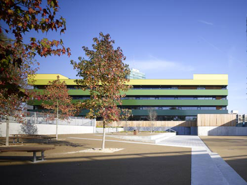
設計案:Westminster Academy
建築師:Allford Hall Monaghan Morris
完工:2007
造價:2500 萬英鎊
業主:Westminster Academy, Westminster City Council, DCSF and Exilarch Foundation
贊助者:Exilarch Foundation
獲獎:
Future Vision Award 2007
BCSE Award Inspiring Design - Secondary School 2008

圖檔

圖檔

圖檔

圖檔

圖檔

圖檔

圖檔

圖檔

圖檔

圖檔

圖檔

圖檔

圖檔

圖檔

圖檔

<a href="http://www.flickr.com/photos/fitlikemin/2616452663/" target="_blank"><img src="http://farm4.static.flickr.com/3213/261 ... 60bc7c.jpg" alt="caught short"></a>

<a href="http://www.flickr.com/photos/myxi/2000610994/" target="_blank"><img src="http://farm3.static.flickr.com/2157/200 ... eb8409.jpg" alt="Westminster City Academy"></a>

<a href="http://www.flickr.com/photos/myxi/1987880608/" target="_blank"><img src="http://farm3.static.flickr.com/2056/198 ... 0b04ab.jpg" alt="Westminster City Academy"></a>

<a href="http://www.flickr.com/photos/myxi/1963766739/" target="_blank"><img src="http://farm3.static.flickr.com/2350/196 ... d7e108.jpg" alt="Westminster City Academy"></a>

<a href="http://www.flickr.com/photos/myxi/1945302780/" target="_blank"><img src="http://farm3.static.flickr.com/2211/194 ... f45514.jpg" alt="Westminster City Academy"></a>

<a href="http://www.flickr.com/photos/myxi/1936483964/" target="_blank"><img src="http://farm3.static.flickr.com/2356/193 ... c8ac47.jpg" alt="Westminster City Academy"></a>

<a href="http://www.flickr.com/photos/myxi/1920931890/" target="_blank"><img src="http://farm3.static.flickr.com/2304/192 ... a6e958.jpg" alt="Cascade"></a>

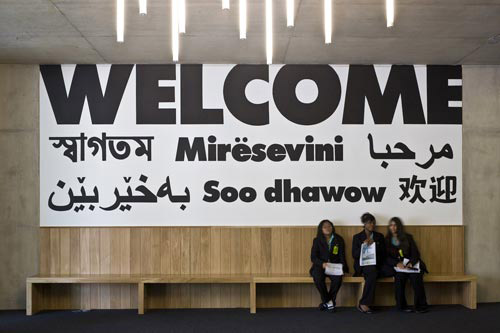
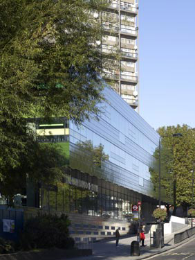
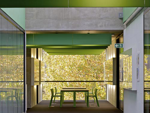
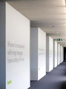
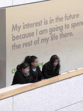
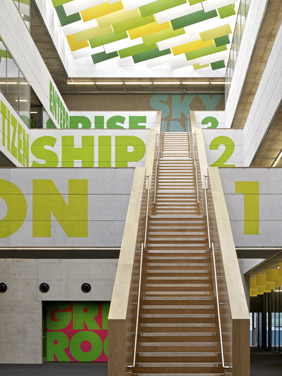
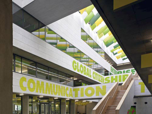
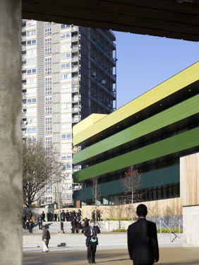
The Academy provides a striking presence ringed by the Westway, the railway and high rise local authority estates. To enter the building you arrive in a generous open area, an inner courtyard that rises up through the building. The basic organisation is teaching and support spaces around the edges with a large full height court at the centre. The arrangement allows high levels of visibility for both staff and students. The graphic signage contributes a level of spirited corporate identity that traditional schools lack.

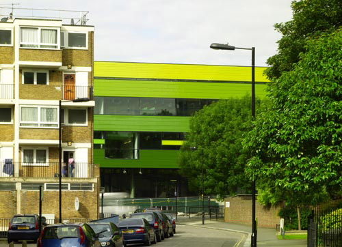
Externally the treatment of the fa&ccedil;ade, using green banded aluminium panels produces a building of very singular identity that suggests a commercial rather than institutional user. The staff and governors who were highly involved in the development of core ideas are immensely excited and proud of their building.
Marco

文章 Marco »

eaGer 寫:沒關係啦, flickr 上的圖我來找好了,你繼續找你能夠找到的部分好了。
foster那案子我跟你重複了 :o
就不再多找了 :P

另外,什麼時候要把伊東這背後靈般的照片拿掉啦 :evil:
eaGer
網站管理者
文章: 14159
註冊時間: 2008-05-04, 11:28
聯繫:

文章 eaGer »

Marco 寫: 另外,什麼時候要把伊東這背後靈般的照片拿掉啦 :evil:
是喔? Toyo Ito 這張相片會像背後靈嗎? 感覺很生動活潑耶.......

圖檔圖檔圖檔
eaGer
網站管理者
文章: 14159
註冊時間: 2008-05-04, 11:28
聯繫:

文章 eaGer »

圖檔

設計案:Terminal 5, Heathrow Airport 英國倫敦希斯洛機場第五航廈
建築師:Richard Rogers, Graham Stirk, Ivan Harbour + Partners
業主:BAA plc
總樓地板面積:
300,000 平方米 Terminal 、 60,000 平方米 Satellite 1、55,000 平方米 Satellite 2
造價:56億英鎊
結構工程師:Arup
服務工程師:DSSR/Arup
品保:Turner & Townsend/E.C. Harris
土木工程師:Mott McDonald
描述:

旅行的定義隨著時空的交替下逐漸改變空間的本質,歐洲最繁忙的機場希斯洛機場,英國航空為了能夠容納更多的旅客,讓空間做更有效的靈活運用,請來國際知名建築師 Richard Rogers,建造第五航站大廈藉以拓展機場空間,讓每位往返其中的旅客擁有最舒適的行走動線,靈活使用的概念被運用在內部設計中,登機處、商業空間、辦公室、旅客休息處以及其他設施,全被包覆在一個典雅、彎曲的浮動屋頂之下,巧妙利用結構規劃,僅由天花的支柱支撐邊緣,呈現開闊的空間視覺感官,讓前來準備登機或是離去的旅客享有最佳的旅程。

在夜裡好似會發光的透明巨大物體,以巨型天幕做為屋頂覆蓋,雖是靜止卻有動態的優雅弧線,以潮水的波浪為發想,形塑自然的流動型態,其中最值得一提的是,包覆建築的巨型天幕並沒有任何支撐物,建築師挑戰結構技術上的可能,僅僅使用如同樹的結構般的鋼鐵支架構成天幕屋頂,作為視覺上的完美呈現。建築兩側則是運用大量的穿透性玻璃,不但放大空間場域,並可藉此引進大量自然光,減少電力使用達到節能的目的,新穎的思維概念在此被逐一呈現,建築師Richard Rogers重新詮釋希斯洛機場新的空間想像。

圖檔

Richard Rogers Partnership (now Rogers Stirk Harbour + Partners (RSHP)) won the competition for Terminal 5 (T5) at Heathrow Airport in 1989. The terminal became operational in March 2008, after being officially opened by Queen Elizabeth II.

The original competition scheme evolved during the 1990s, shaped by changing requirements, including a dramatic reduction in site area and different security needs.

The built scheme for the main terminal offers an unencumbered, long-span 『envelope' – developed with Arup – with a flexibility of internal space conceptually similar to that of the practice's much earlier design for the Pompidou Centre in Paris. Departure and arrivals areas, check-in desks, commercial space, retail, offices, passenger lounges, back-up and other facilities are all contained within freestanding steel-framed structures inside the building and can be dismantled and reconfigured as future needs change. The built, multi-level scheme is contained beneath an elegant, curved floating roof, supported by slim columns at the perimeter edges to provide the required highly flexible and visually dramatic internal space. In this scheme, passengers depart and arrive in a terminal building which offers generous spaces and fine views across the airport.

As well as the design of the main terminal building, RSHP is also responsible for the design of two satellites. The first satellite opens in parallel with the main terminal building, and the second – with all sub-groundwork and station already in place – is due to open in 2010. The practice also designed Heathrow's new control tower as part of the wider T5 project, which became operational in early 2007.

The main terminal, its satellite buildings, and the new control tower are all part of a wider T5 campus development that includes a landscaped motorway link from the M25, the creation of two new open rivers from previously culverted channels under the airport, the construction of more than a square kilometre of taxi-ways and aircraft stands, three rail stations (for the Piccadilly line, Heathrow Express, and overland rail), an airside track transit system, and an airside road tunnel connecting directly to Heathrow's central terminal area. The total cost of the whole T5 campus is L 4.3 billion.

圖檔

圖檔

圖檔

圖檔

圖檔

圖檔

圖檔

圖檔

圖檔
eaGer
網站管理者
文章: 14159
註冊時間: 2008-05-04, 11:28
聯繫:

文章 eaGer »

抱歉,本來希斯洛機場第五航站是我昨天的進度,拖到今天才上........

馬可請幫忙注意一下,由於轉碼的關係,英鎊那個很像 L 的貨幣符號有時候會變成亂碼,所以我都直接改成「英鎊」。

剩下以下這些:

Full list of RIBA European Award winners:

Am Kupfergraben 10, Berlin, Germany by David Chipperfield Architects

Amsterdam Bijlmer Arena Station, Amsterdam, Netherlands by Grimshaw/ARCADIS Architecten

BMW Welt Event, Exhibition and Automobile Delivery Centre, Munich, Germany by Coop Himmelb(l)au, Wolf D Prix, W. Dreibholz & Partner ZT GmbH

Carabanchel Social Housing, Madrid, Spain by Foreign Office Architects

Empire Riverside Hotel & Brauhaus, Hamburg, Germany by David Chipperfield Architects

Lufthansa Aviation Center Frankfurt a.M, Frankfurt, Germany by Ingenhoven Architects

Nord Park Cable Railway, Austria by Zaha Hadid Architects

The Royal Playhouse, Copenhagen, Denmark by Lundgaard & Tranberg Arkitektfirma

The Sleeping Giant, Co.Dublin, Ireland by O'Donnell + Tuomey Architects

University of Limerick, Limerick, Ireland by Wilkinson Eyre Architects

Lubetkin Prize Winner

Casa Kike, Cahuita, Costa Rica, by Gianni Botsford Architects
eaGer
網站管理者
文章: 14159
註冊時間: 2008-05-04, 11:28
聯繫:

文章 eaGer »

我在想,這一大串資料都找到之後,要移轉至「競圖+競賽+獎項」版面才對,而且阿則應該會有興趣將我們整理好的這些資料轉貼到 archifield 上給更多人看到吧。
eaGer
網站管理者
文章: 14159
註冊時間: 2008-05-04, 11:28
聯繫:

文章 eaGer »

圖檔

設計案:Am Kupfergraben 10, Berlin, Germany
建築師:David Chipperfield Architects
業主:Celine and Heiner Bastian
總樓地板面積:2000 平方米
位置:http://www.panoramio.com/photo/10884188
描述:

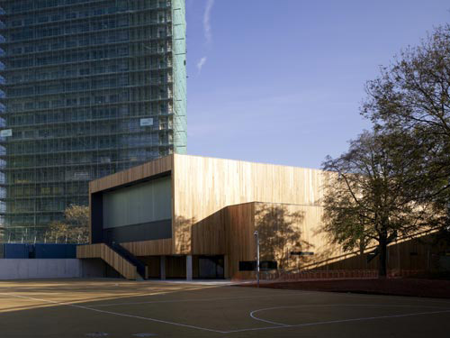
此設計案是為柏林藝術品商 Heiner Bastian 所設計,兼具生活、工作、藝廊功能,於 2007年11月開幕。

Here on the Kupfergraben canal the intention was to build a modern building which incorporates, but doesn’t replicate the past. As an urban repair, the new building occupies the footprint of the preceding building (destroyed in the war), while at the same time developing a sculptural quality. The facades are composed of brick masonry on reconstituted stone consoles with no visible expansion joints. While solid, age-resistant materials characterise the exterior, the interior is defined by daylight and proportion. Throughout the 4 storeys the floor plan varies depending on the formation of the volume and the window openings. The gallery spaces are lit from the side, and interior folding shutters make it possible to reduce the amount of daylight. In contrast to a museum, the intention is to create good spaces, where one can live, work, or show art - in a townhouse dedicated to the arts, where it is not isolated from the world, but directly related to the cultural heart of the city.
圖檔

圖檔

圖檔

圖檔

圖檔

圖檔

圖檔

圖檔

圖檔

圖檔

圖檔

圖檔
eaGer
網站管理者
文章: 14159
註冊時間: 2008-05-04, 11:28
聯繫:

文章 eaGer »

圖檔

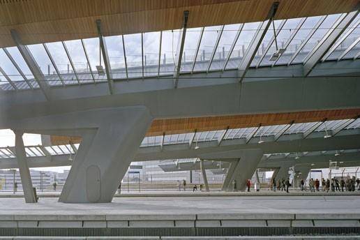
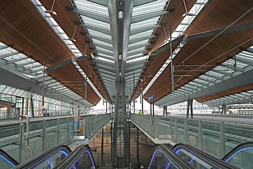
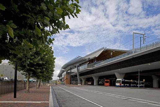
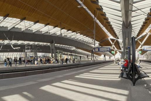
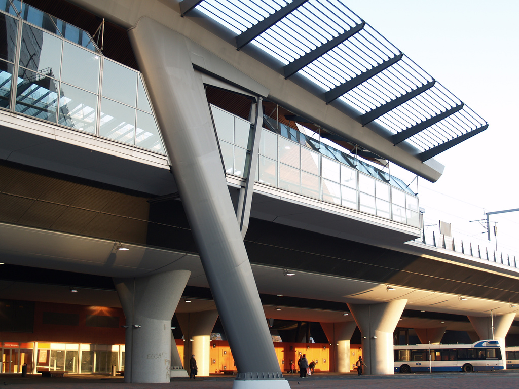
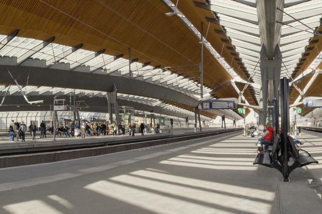
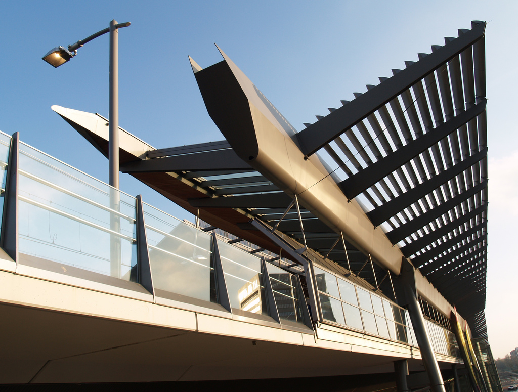
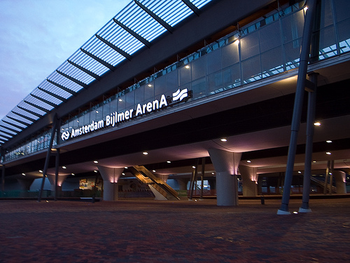
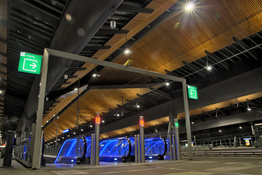
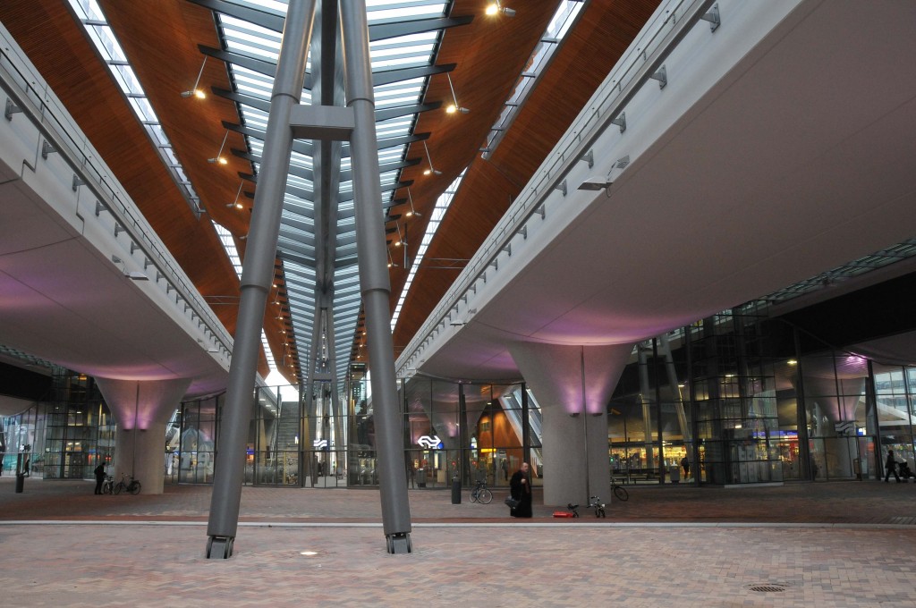
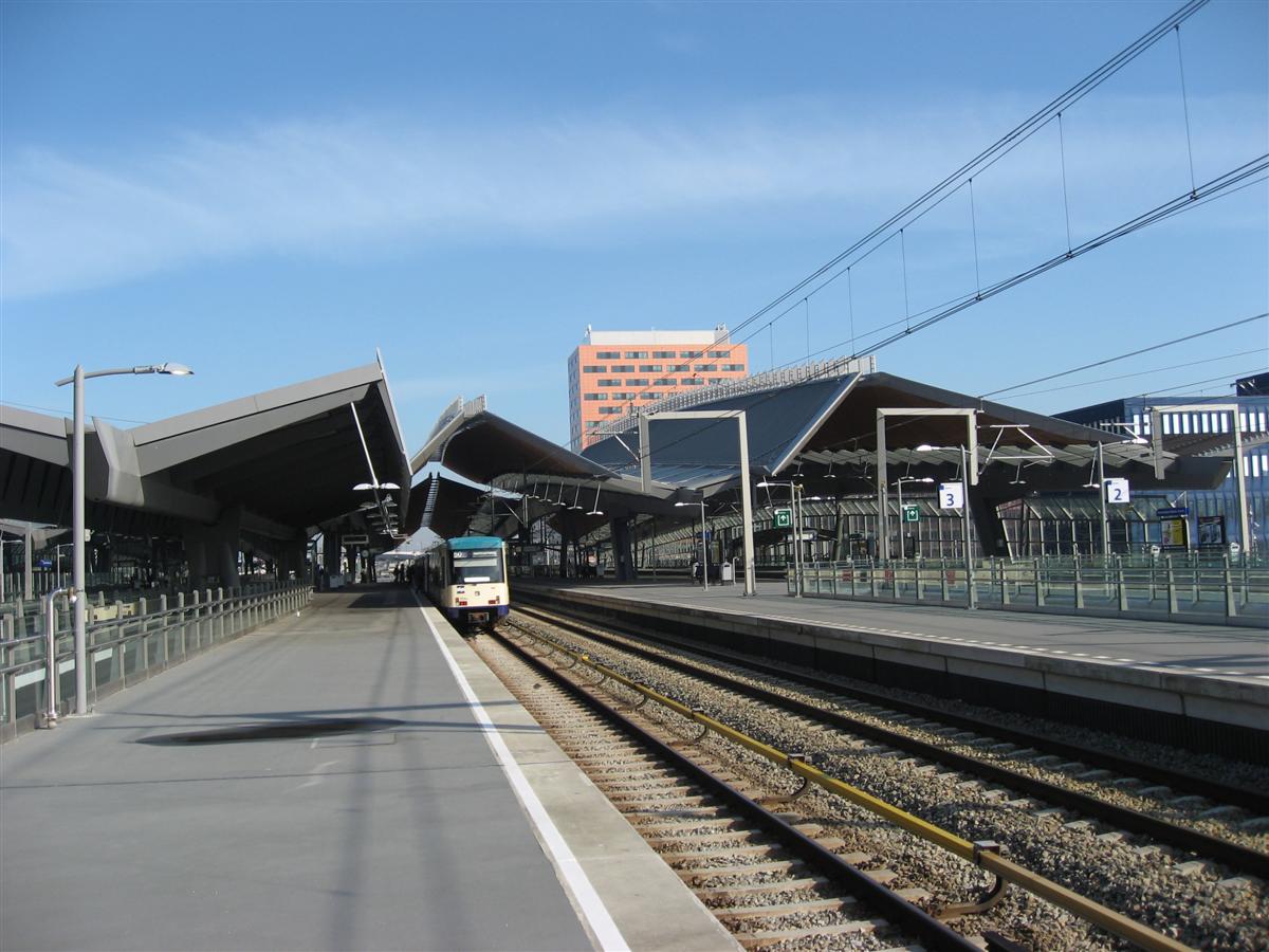
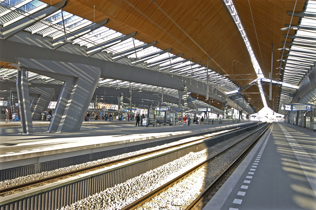
設計案:Amsterdam Bijlmer Arena Station 車站, Amsterdam, Netherlands
建築師:Nicholas Grimshaw / ARCADIS Architecten
業主: ProRail and City of Amsterdam
總樓地板面積:60,000 平方米
設計: 1997年9月至2002年1月
完工:2007年11月
造價:2930 萬英鎊
描述:

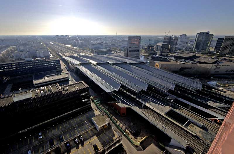
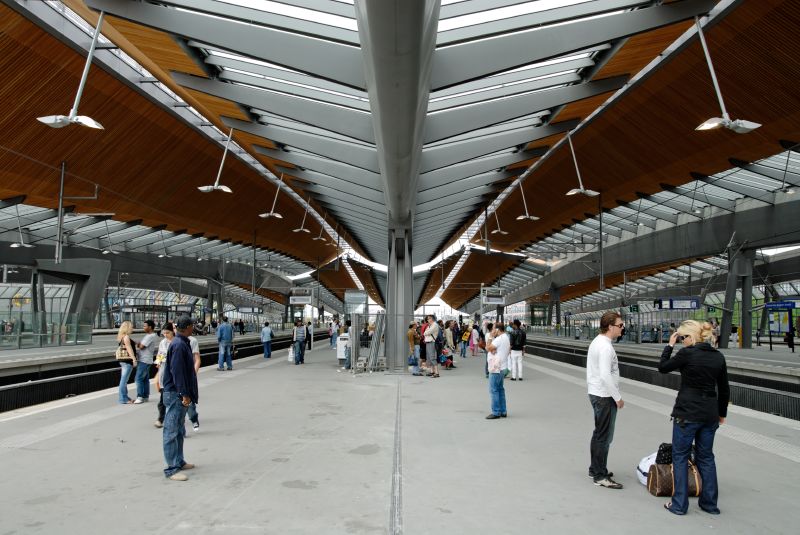
Amsterdam Bijlmer ArenA Station is situated on the southeast of the city on the line that links Amsterdam with Utrecht. To the west there is a commercial development area punctuated by the newly built Amsterdam Arena, a 50,000 seat football stadium. To the east there is a large residential area with a high proportion of social housing which has become home for large sections of Amsterdam’s immigrant population. Prior to this project, there were four tracks running on a raised earth embankment that split the area in two. The only pedestrian connection was a narrow and dark tunnel within the old suburban station.

On behalf of the City of Amsterdam, Dutch architect Pi de Bruijn proposed a 70m wide pedestrian boulevard aligned diagonally to the railway tracks to connect the two districts. Although initially ProRail were just planning to add a pair of 200km/h tracks on the Amsterdam-Utrecht line alongside the existing ones, they agreed to rebuild a 2km stretch of existing railway with the sole aim of increasing the available height above the planned boulevard by almost 2m. Both clients then agreed to pool funds in respect of a new station, which was to be a transport hub in respect of the national train service, the Amsterdam Metro, buses and taxis, and which was to be sized to cope with Arena crowds on major match days.

Grimshaw worked with Arcadis Architecten on the redevelopment of the station, which had to remain open for the entire duration of construction. This had an important influence on the final design. A viaduct carrying the extra pair of tracks was constructed first and trains from an existing pair of tracks were then rerouted onto it, liberating the latter area as a construction site. This area of embankment was then excavated against temporary sheet piling installed to retain the adjacent “live” one. The process was repeated until there were eight new tracks running at the raised level. The roof enclosure followed sequentially.

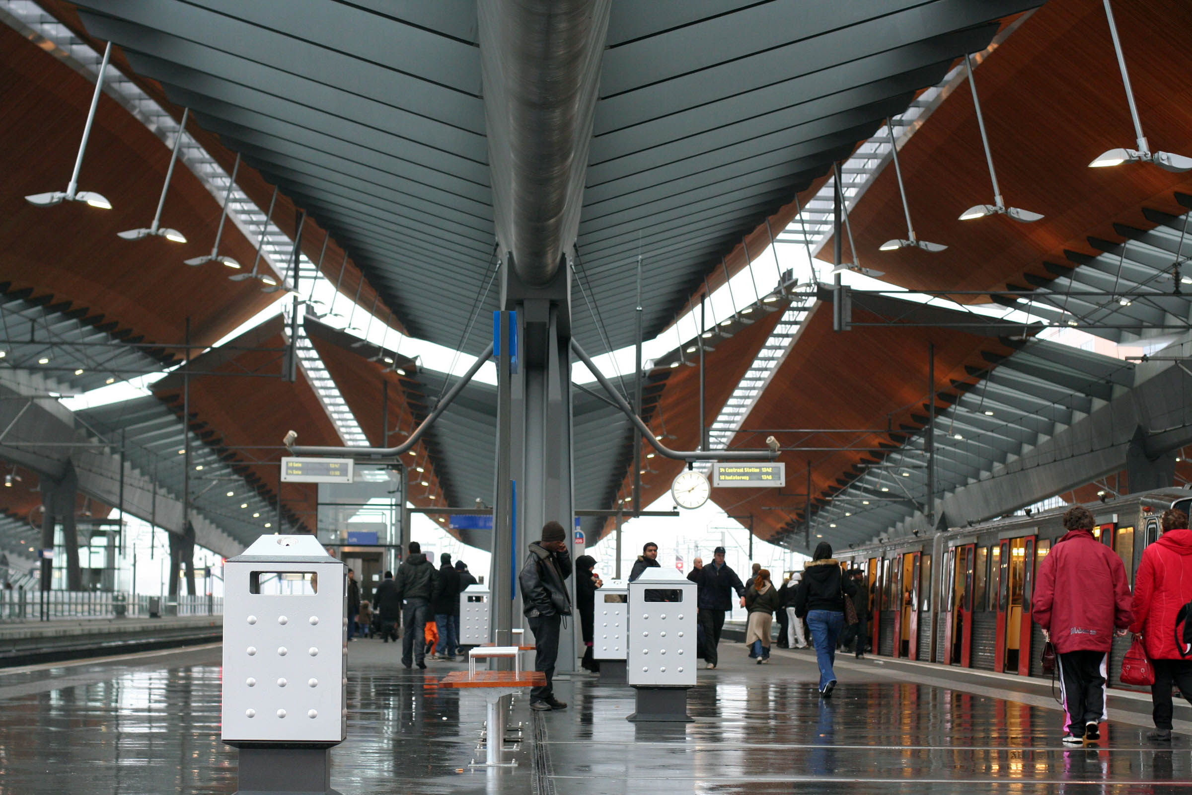
Every aspect of the design process was informed by the need to civilise these viaducts and to create a pleasant and safe ground level public space. To avoid a dark 100m long tunnel, the concrete structures were spaced apart. Each 20m span was supported at each end on just one column via an integrated cantilevered saddle. Arrays of columns were then aligned on axis with the boulevard to maximise visual connectivity from east to west. However, the most important decision concerned the roof design in general and its soffit treatment in particular. It is the modulation of this surface, its ribbons of roof glazing and its acoustically absorbent Oregon pine surfaces that convey civility from the perspective of the boulevard and the platforms below.

The base-element of the roof structure is a “V” shaped continuous hollow steel boom with steel arms cantilevered on either side to support all the roof glazing. The combined assembly is supported on a series of tubular “A” frames with only a single deep longitudinal stabiliser near the south end. Beyond their last supports these booms cantilever up to 18m thereby enhancing the sense of linearity and direction. The timber lined elements straddle each track-bed and are open at ridge level to assist natural ventilation and allow areas for pressure release in respect of 200k/h trains.

The lack of land to either side dictated a corresponding diagonal station hall facing the boulevard under the tracks. This diagonal slant dictated that the escalators, stair, lifts and roofs all be staggered. To signal the presence of the buried station hall from the surrounding area it was decided to gently arch each boom structure and to split all roof planes above the primary vertical circulation. The station’s angular aesthetic is derived from this methodology. The station is designed to provide a high level of social security both during the day and at night. Long voids are cut into the platforms to break down the overshadowed sections of the 100m wide area below the viaducts. These voids improve the sense of safety through visual contact and improved transparency between the platform and ground level areas.

They also permit the boulevard and bus station areas to be flooded with natural light. The station hall and platforms are also designed for maximum transparency to improve the orientation of travellers within the building. Escalators, stairs and glazed lifts lead the public from the central ticket hall up to the platforms.

The building has been warmly received in Amsterdam and is generally perceived as a catalyst for the development of the area on both sides of the tracks. Several related projects are already under way, including a parade of shops facing the station hall on the boulevard’s north side and the complete overhaul of the square immediately to the east currently cluttered with a series of temporary buildings.
圖片:

圖檔

圖檔

圖檔

圖檔

圖檔

圖檔

圖檔

圖檔

圖檔

圖檔

圖檔

圖檔

圖檔

圖檔

圖檔

圖檔
最後由 eaGer 於 2008-07-19, 19:26 編輯,總共編輯了 2 次。
回覆文章